Kapitol Font (& Companion) Achieve Peak Aesthetic in Typeface Design
The Kapitol typeface and limited-edition box set are drool-worthy for the discerning font-lover.
"Peak aesthetic" is taking a beautiful thing and conveying it simply and elegantly, creating a delightful apex of expressive promotion.
To achieve what I think of as "peak aesthetic" is an admirable goal. But it's hard to do with exactness. Aspiring to do something and executing it are miles, sometimes continents apart, and bridging the gap between precisely producing a beautiful thing, and then promoting said beautiful thing with an artistic flourish, is a venture fraught with peril.
This is not the arena of "it's the thought that counts." When it comes to spreading the word about something that is already intrinsically fantastic (in this case, one of the coolest new typefaces you can get), you either nail it, or you mess it up.
Even in the world of specialty typeface design, (which is home to a community of some of the design world's most thoughtful creatives) it's easier to mess it up than you might think.
But Mark Gowing didn't mess it up.
The World of Formist
Formist designs are idiosyncratic, distinct, thoughtful, and precise.
In fact, when it comes to achieving peak aesthetic, Sydney-based Gowing seems to have his process (and outcomes) dialed in rather nicely. He is the prime mover behind several fascinating multimedia projects, including the minimalist-vibed, trip-without-drugs-inducing audio project Longform Editions, and the awards-garnering specialty publisher Formist Editions. Sidenote: check out Kris Sowersby's The Art of Letters as exhibit A of Formist Edition's prowess in this department.
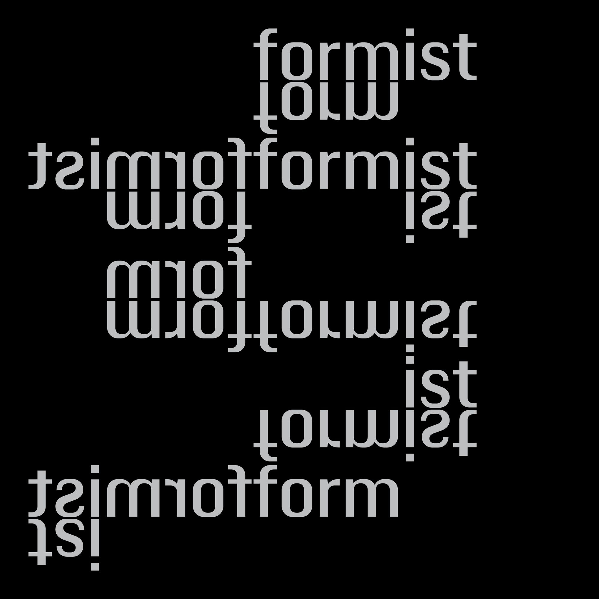
Gowing is also an ace typeface designer, and he oversees the development of new designs through Formist, a type foundry that confidently walks the tightrope of creating fonts that are novel yet utilitarian. Formist typefaces are idiosyncratic, distinct, thoughtful, and precise. In an industry constantly striving for innovation, the foundry exhibits a knack for doing just that. From the interlocking revelations of Serous to the punkvibed, subtly-rebellious sans-serif, Fiction, Formist is putting out some truly unique specimens for public usage.
I'm certainly not the first to take note of Gowing's numerous talents– he's garnered notable accolades throughout his distinguished, diverse, cross-category career developing projects in the visual arts, language, design, film, and music. But I'm certainly a recent beneficiary. The CORTIS team recently put our much-too-involved, bordering-on-obsessive search for a one-of-a-kind typeface for this website to bed with the discovery of Kapitol, designed by Gowing and Dave Foster.
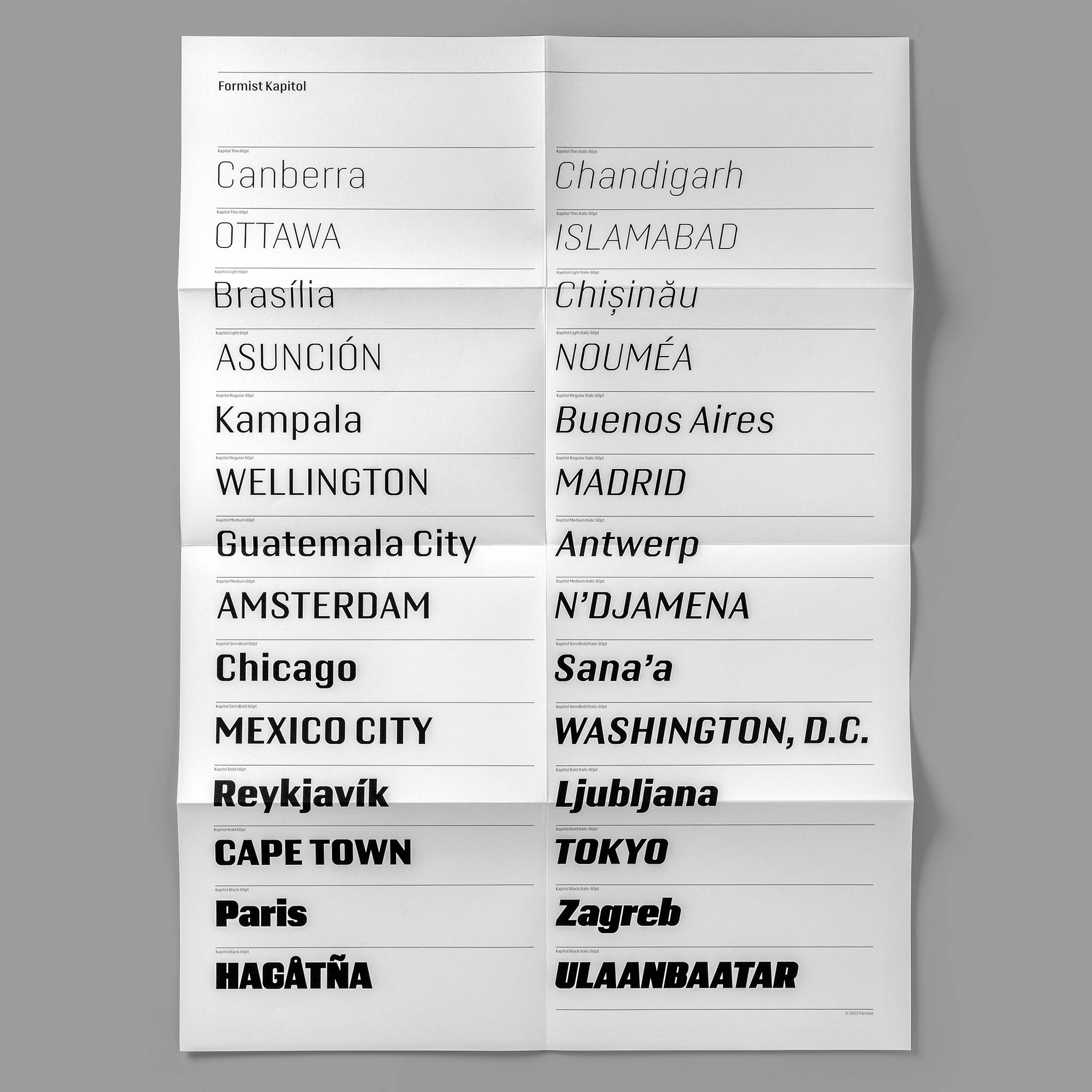
The Bread: Kapitol, the Typeface
Formist's motto is "Typefaces of rigour and invention", and it's one of the more captivating slogans-as-manifestos I've seen.
Kapitol is engineered to pay homage to and expound upon Susan Kare's 1984 font classic, Chicago. According to Formist, "Kapitol’s graphic feel creates a unique typographic tone that honors its very recent heritage while driving forward with a contemporary confidence."
Hard to say it better. I could extol the virtues of this typeface all day, but suffice it to say that you are looking at Kapitol right now, and I beckon you to look at it, on this website, to your little heart's content.
Sharing is caring, so, dear reader, you also have my blessing and encouragement, (and indeed Formists) to license and use this awesome font for your website for your own little budding media empire. Smiley-face-wink.
The Butter: The Kapitol TypeFace Companion
The Kapitol Companion is a special edition item that is actually special.
Here's where we get to this peak aesthetic we've been chattering about. Not content on just designing a dope typeface, Formist has paired the release with a limited edition set that brings it all together for the discerning collector-in-the-know.
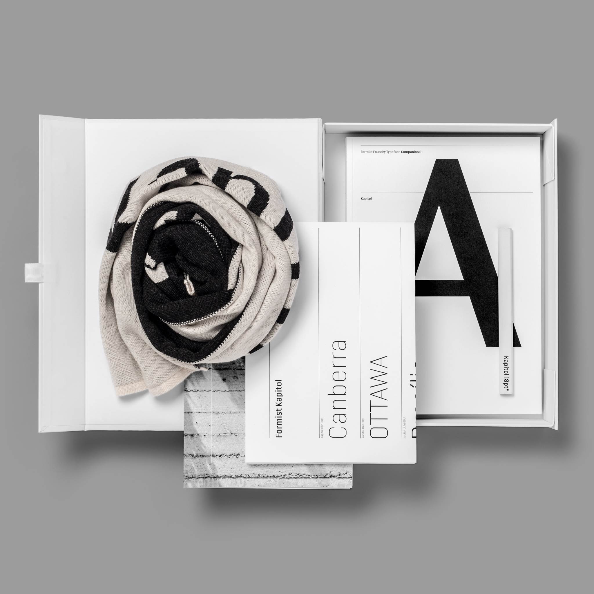
The Kapitol Companion is a must-have package for those who want to add some extra swag and swagger to their excellent taste. There are only 50 of these, so get it while you can.
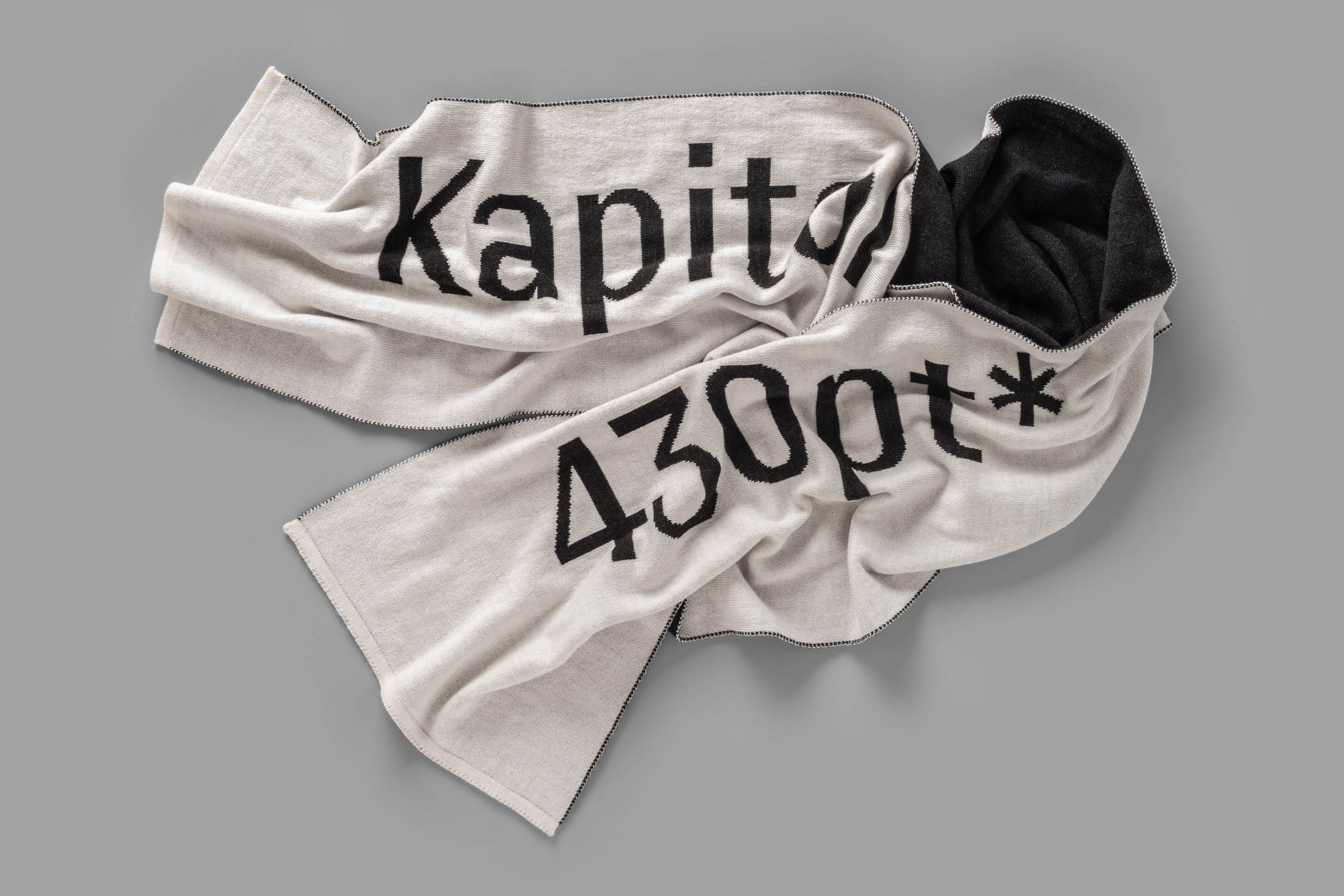
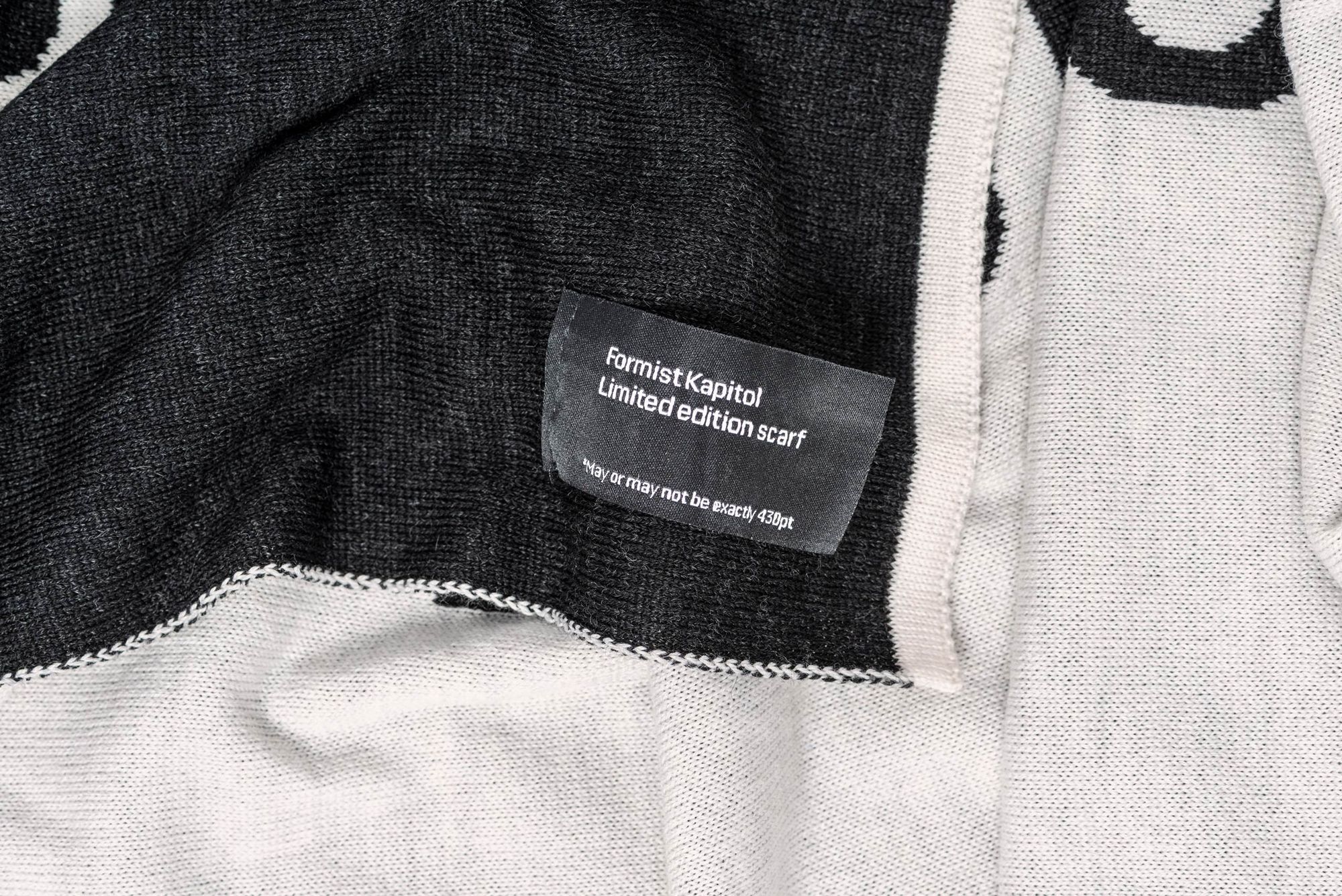
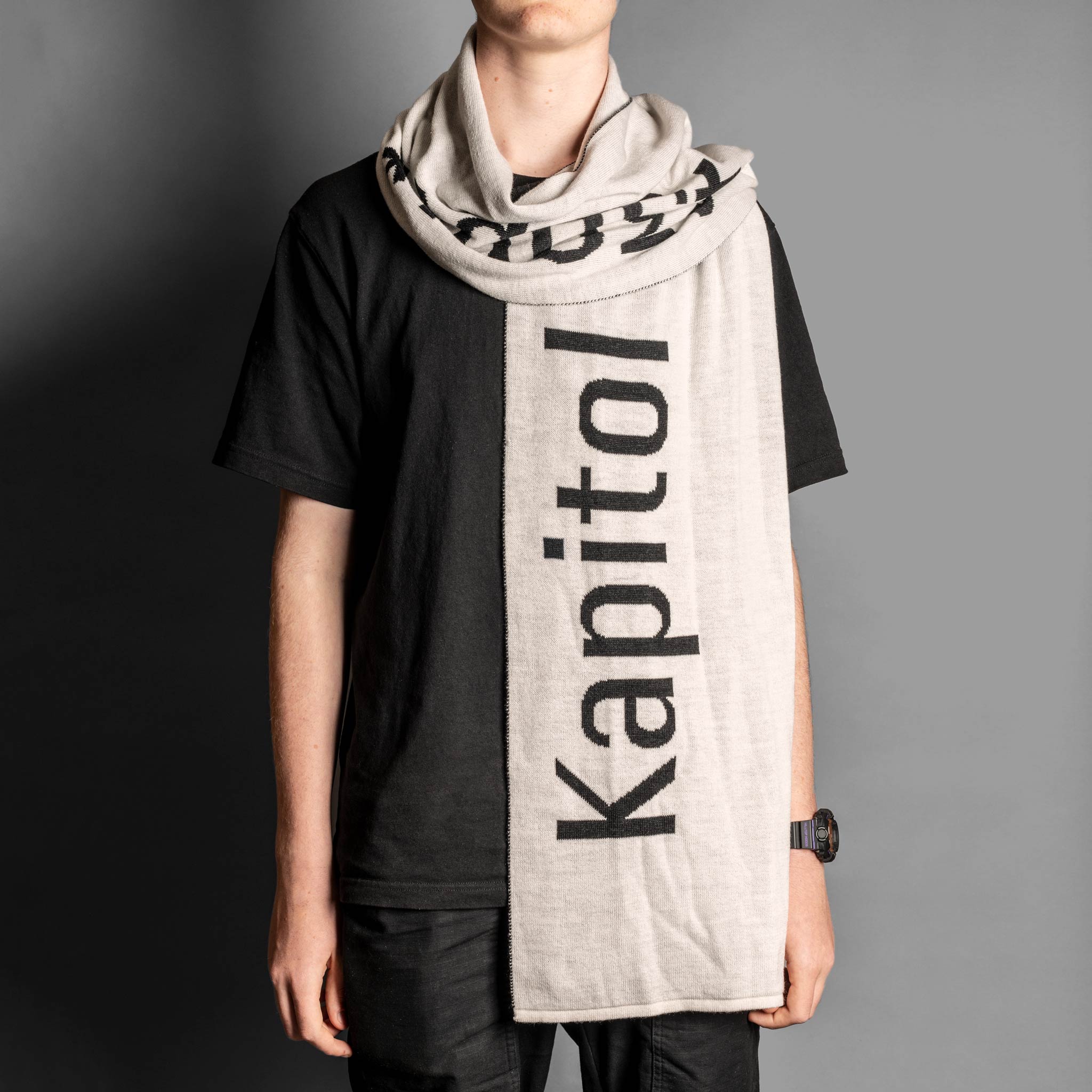
It includes a custom-knitted-in-Melbourne, extra-fine Merino scarf o' awesomeness in 430pt Kapitol font, a license for the Kapitol variable font(!) and the following:
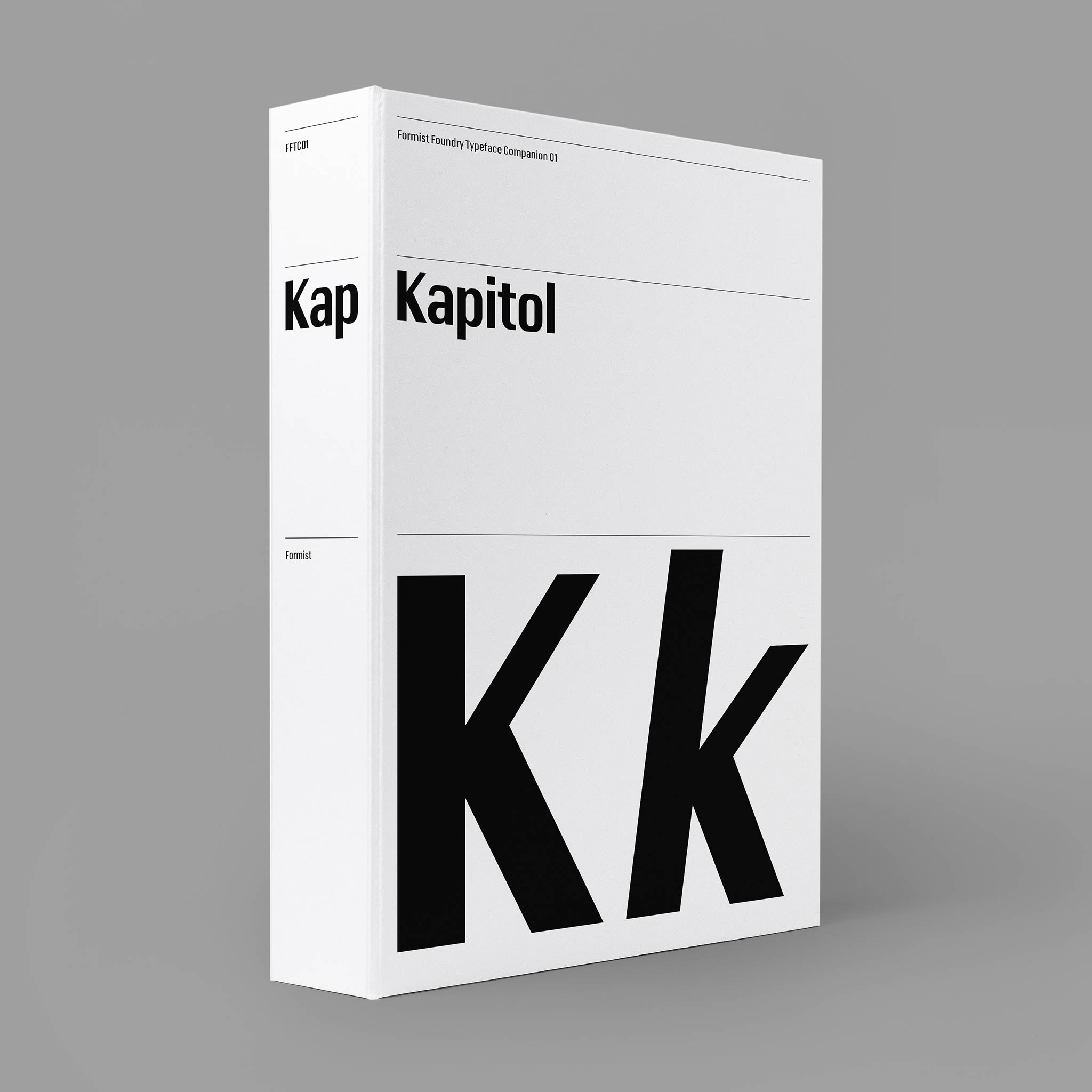
- A laminated magnetic-close Kapitol Typeface Companion box, printed with raised gloss black, signed and numbered by Mark Gowing.
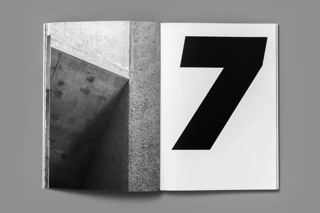
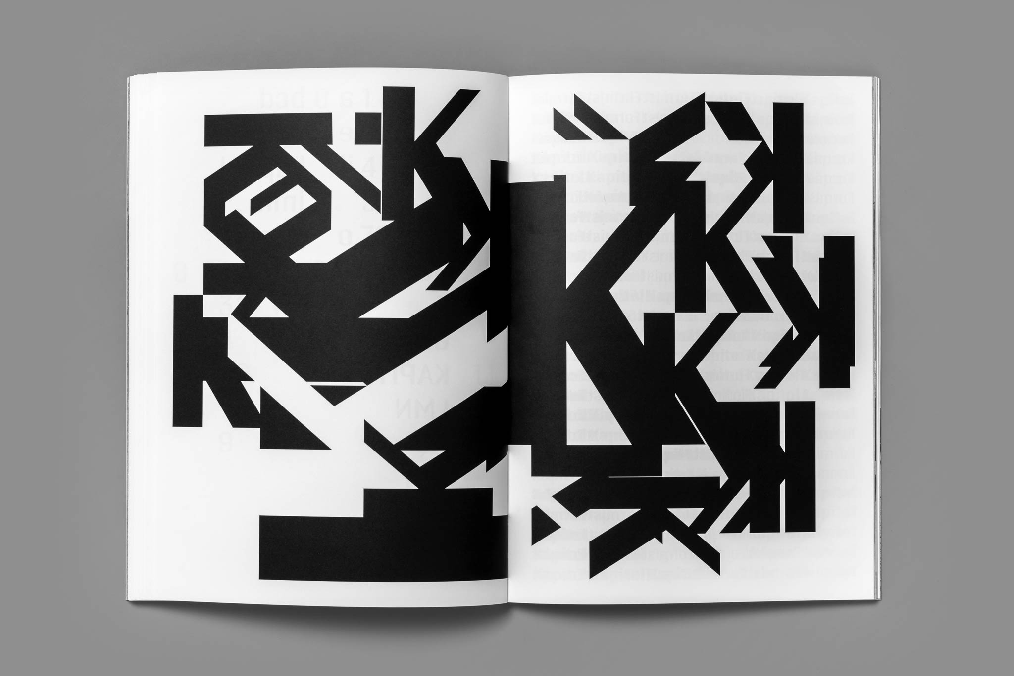
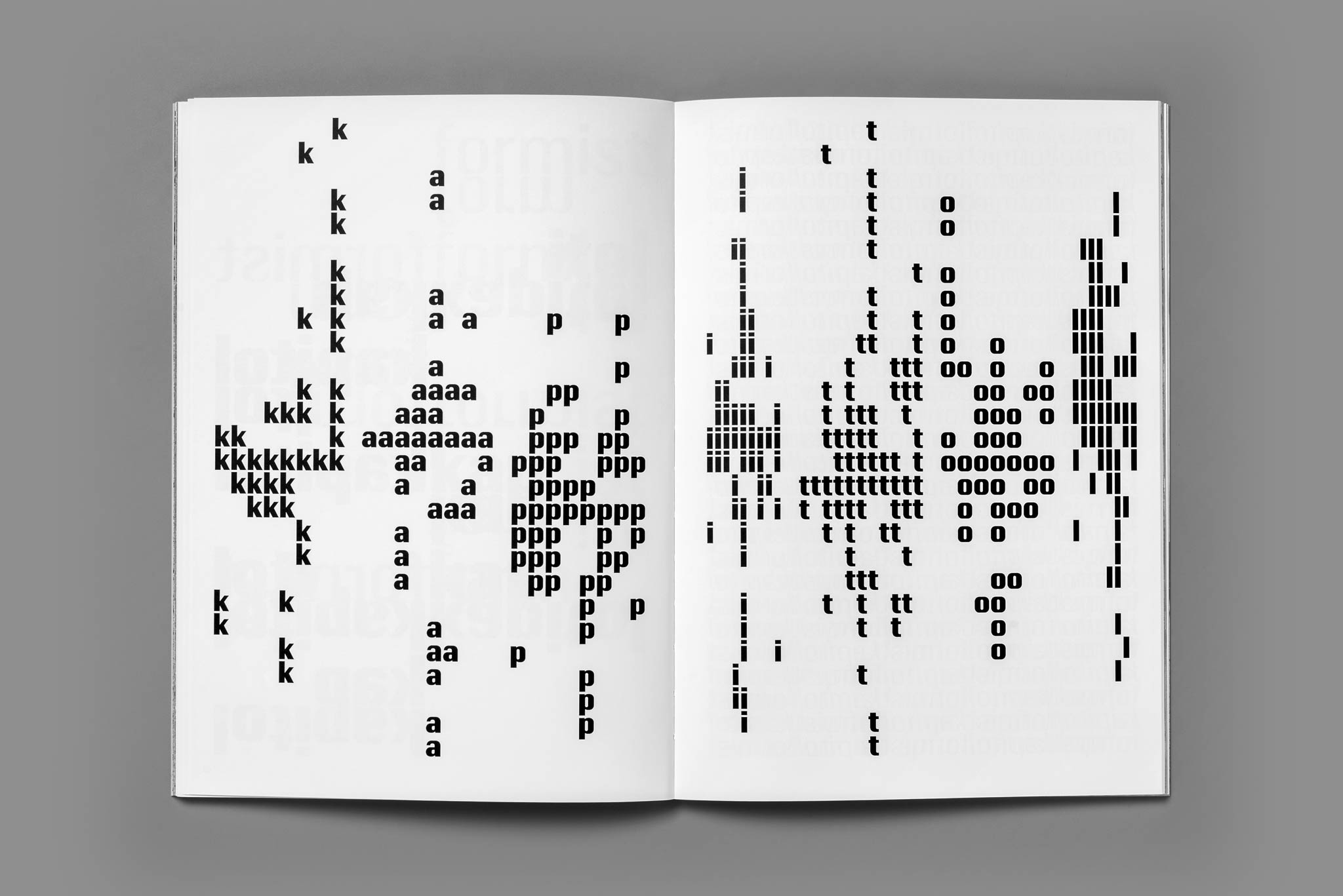
- Kapitol Typeface Companion specimen book. A limited edition 160-page book, featuring an essay about the creation of Kapitol; detailed specimen typesettings; expressive typographic experiments and tributes; large Kapitol glyphs; and a collection of black and white photographs by Gowing, featuring Brutalist concrete architecture in Australia’s capital city, Canberra.
- A Kapitol carpenter’s pencil, printed with the typeface name and the size it appears on the pencil: 18pt.
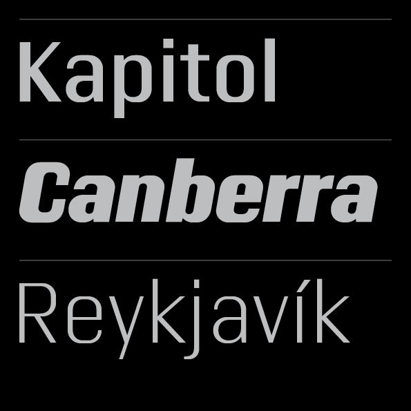
- Two posters, 50 × 70 cm each. One is a Kapitol specimen featuring city names of the world, and the other is a photographic poster featuring a Kapitol letter k.
The Kapitol Companion is available in limited numbers and includes a desktop license for the typeface.
Get it here:


KAPITOL limited edition box set
Just want the typeface? Get it here:

KAPITOL
Follow Formist on Instagram.


